🚀 Building Responsive Canvas Apps in Power Apps
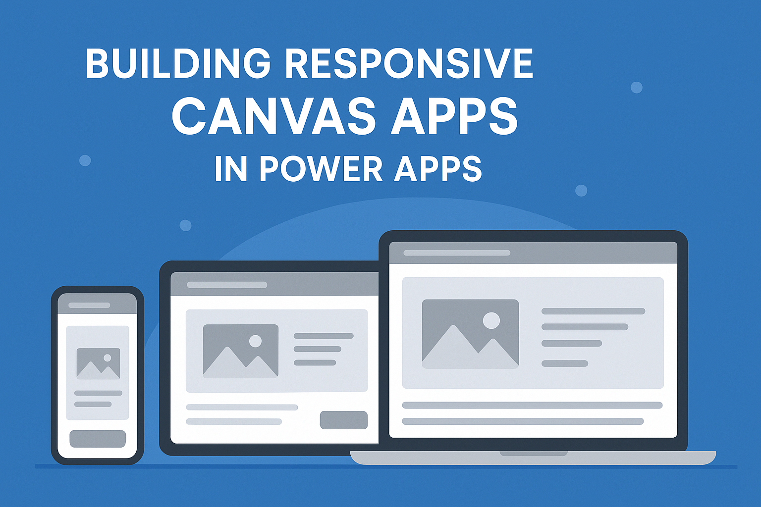
When building Canvas Apps in Power Apps, one of the biggest challenges is making sure the app looks great on different screen sizes — desktops, tablets, and mobiles. A responsive design ensures your users get a smooth experience no matter what device they use.
🔹 Why Responsiveness Matters
• Users may open your app on a laptop today and on a mobile tomorrow.
• Fixed layouts can break the design or make the app unusable on smaller screens.
• A responsive app = better adoption and user satisfaction.
🔹 Key Techniques for Responsive Canvas Apps
1. Use Relative Positioning (X, Y, Width, Height)
• Instead of hardcoding values, use formulas.
• Example:
• Width = Parent.Width * 0.5 (50% width of the parent container).
• X = (Parent.Width - Self.Width)/2 (centering controls).
2. Leverage Containers
• Horizontal & Vertical containers adjust layout automatically.
• Combine with Flexible Height gallery for dynamic screen fitting.
3. Use App.Width and App.Height
• Check device size with formulas.
• Example:
If(App.Width < 600, "Mobile Layout", "Tablet/Desktop Layout")
4. Lock Aspect Ratios for Images & Videos
• Prevents distortion across devices.
5. Test in Multiple Screen Sizes
• Use Preview Mode and adjust screen size to validate responsiveness.
🔹 Pro Tips
✅ Start with a tablet layout and scale down for mobile.
✅ Define breakpoints (e.g., 600px, 900px) for different experiences.
✅ Use auto-layout containers for complex forms and dashboards.
🔹 Closing Thoughts
Responsive design in Canvas Apps may take some extra effort upfront, but it pays off in delivering a professional and user-friendly experience. As Power Apps becomes a go-to tool for enterprise apps, responsiveness will be a key differentiator for makers and trainers.
⸻
👉 What challenges have you faced while making your Canvas Apps responsive?


